 Skip to content


Interior Colour Guide – Matching Moods with Rooms
This is why it’s important to consider the colours of rooms and furniture when outfitting them. Just the right shade on the walls, and tone of the furniture’s finish can make you feel warmer, happier or less anxious. Here we look at how you can tailor a room to an ideal mood for its purpose.
The Bedroom Blues
The bedroom is where we go to relax and sleep, it’s both an intensely personal space and somewhere we want to be welcoming. We may not spend all our time there, but it does need to have a calming colour palette to be comforting when getting ready to sleep and this is where the décor plays a very important role.
While it may seem counterintuitive with its image of being of a cold colour, blue actually creates a peaceful atmosphere that is ideal for a room where we spend most of our time sleeping. Calm colours help you relax, making it easier to drift off and be restful and can be easily lightened up with accessories. A rich, deep blue bed frame surrounded by bold bedside tables can really create a chilled out ambience ideal for a great night’s sleep.

Natural Living
The living room is where we spend our downtime, where we socialise and decompress so there’s no surprise that we want it to feel like a safe and secure environment. This sort of effect can be achieved with natural tones, brown and wooden colours that bring the outside in without us having to venture beyond the confines of our warm and toasty living area.
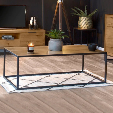
This can be achieved in a number of ways; you could add a highly stylised coffee table to help break up the room. If you want to go with a more naturalistic look, you could think about a more natural looking wooden finish on a statement piece such as a sideboard. Other happy colours, like yellow and orange may also be an option.

The Right Study Setting
An office or study needs to give the right atmosphere for learning and working and mood colours can contribute to that focus. Projecting authority and dignity while not being distracted makes grey the perfect colour for these sorts of settings but you can do this without it becoming drab and unenticing.
A large and stylish desk can be easily accessorised and made more homely for whiling away the hours, and a high class and extremely comfortable chair to match can give a sense of luxury in an everyday environment. Different tones of grey can be used to create a more dynamic and chic-like look.

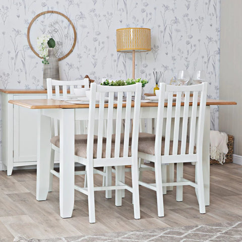
Dine in White
Having anything white near food is often a disaster waiting to happen but if it’s a dining room with durable oak furniture and wipe clean surfaces, it’s probably a good shout. This is because white is a sign of purity, safety, knowledge, and goodness, and presents a clean, bright setting to sit, eat and socialise in.
A white dining table is easy to spot any spills on and also lends an aura of freshness to the area and its surroundings. Complement this with dining chairs and you’ll complete a classy and elegant look.

To see more of what styles and colours we have in our comprehensive range of furniture, view our collections here.